Logo Design
Impressive visual trademarks that identify your brand and reflect the values of your corporate.
Corporate identity
Corporate’s visual identity has a significant role in the way an organization presents itself to interested and potential stakeholders.
Professional tips on logo design for designers and companies:
NAB Advertising Agency designs logos and provide the service of trademarks legal registration.
NAB Advertising Agency has the honor to design logos and trademarks for many large, medium and small companies according to the international standards; such as:
Egypt Fund
Sinai University
Our sons Association in Makah
The conformity logo for GCC Standardization Corporate
Byotat Real Estate Company
And many other entities…
Click here to get your impressive logo, or if you have further inquiries.
For more information kindly contact us directly:
To contact us from Qatar please dial: 50394001
To contact us from Saudi Arabia please dial: 0556633059
To contact us from Egypt please dial: 01123986926
It is our honor to explain some principals, concepts and tips for you to consider when designing a logo whether you are a company, an advertising agency or a graphic designer.
What is the logo?
A logo is the graphic mark designed by a designer to achieve direct recognition for an corporate, a corporate, a political movement, an event or a social activity.
This logo usually consists of the company name -written distinctively- accompanied with unique graphical elements and a slogan or a phrase defining the market position of the company -usually placed under the wording.
The way to gather these elements through their relations with each other is what we call a logo. The importance of the logo is quite clear as it forms the first impression of the targeted audience, and it appears in all the advertising campaigns, including printed or in-motion advertisements, as well as the official papers of the corporate and their seals.
Most of the well-known corporates continue to use the same logo forever and never change it. Even If this corporate had to amend the logo, the changes are usually minors and can be confined to introducing the logo in 3D form or adding minor effects to the logo fonts without changing the logo completely since it represents a point of trust between the consumer and the corporate.
Therefore the logo is considered to be the most significant element of the brand and it usually consists of 3 symbols:
1- ™ this symbol stands for an unregistered trademark used to promote goods.
2- ℠ this symbol stands for an unregistered trademark used to promote services.
3- ® this symbol stands for a registered trademark used to promote goods and services as well.
As for the logo, it can be divided into three types:
1- ( Typography Logo ) is a written logo that consists of a particular font like the logos used for Coca Cola, Google and Facebook; where there is no drawing nor symbols.
2- Iconic design that consists of a drawing or symbol with no writing like Apple and Google Chrome logos.
3- Combination Logos are designs that consist of both writing and symbols as well, such as Pepsi, Puma, Adidas, KFC logos.
NAB Advertising Agency has a proud history in designing many logos either through direct mandate or via competitions in Egypt and Gulf Countries.
NAB Advertising Agency advises any designer who wants to design logo to do the following:
1- Be simple; simplicity in choosing shapes and colors is the main key to success. It is preferable to create a logo of two colors whether flat or in shades.
2- Choose a peculiar form that would be easy to remember by your client since this is the most important factor for the success of the corporate logo. This factor helps the customer to easily remember the logo and thus contribute to the success of the corporate and gives the viewer the impression of the importance of the corporate or the owner of the logo.
3- The easiness of application and handling the logo is important too. The designer has to take into account when designing a logo to make it suitable for all applications and usage on media whether printed or in-motion. The logo should not be distorted when printed in black and white or when resized.
Therefore it should be easy to print it via fax, in newspaper advertisements, in black and white, in different size, on personal ID, small product or street placards.
– To keep the logo from distortion when minimized, the elements of the logo should be few and with appropriate relevant distances separating them from each other. The void spaces among them should not be less than 8% of the total size of the logo so the elements would not stick to each other when printed on small sizes such as printing them on pens using silk screen printing machines.
4- Choose the appropriate font, if the logo is based on drawings without font elements. However in case of choosing fonts, characters or the name of the corporate, the designer should be aware that the font should be peculiar to add more distinction and autonomy to the logo among similar products.
It will add distinguished features to the logo. The name of the corporate should be written in a professional font and easy to be read. The writing should be of one or two words maximum. In case the name consists of more than two words, it should be put in short forms (if it is written in English; however the idea of writing the name short names in the Arabic language is ineffective).
In case of adding a picture next to the writing, the designer should consider the consistency between the sizes of the font and the shape. The ratio should ranges from 30% to three doubles of the ratio between the sole drawing and the name of the corporate.
– for example, the company name can be designed through manipulating the initials whether written in capital or small characters or using different colors in the same word, or even put the characters in reverse horizontally.
– for example:The designer should not use a unified font, color, or a standard format for the name of the corporate in order to create a movement that would catch the eye of the viewer, since the inconsistency attracts attention Look like that :
NAB | Advertising
NaB | AdVerTising
NAB | Advertising
5- Try to spend your more time discovering different logos, this will definitely enrich your creativity and enable you to produce a peculiar, distinctive design and similar to none.
6- Successful logos belong in schools of art to the abstract school. Therefore, any logo should not be reflective but abstract. For example: when we reflect on a person we don’t draw this person in details, but we use abstract lines to draw the body and a circle to symbolize the head. We can also use geometric shapes after twisting and reforming them to express the idea. We may also link the abstract forms and the special characters of the name of the company to make it a professional logo depending mainly on manipulating the characters to create a distinctive shape.
————-
The Previous factors from our point of view are enough to create a successful distinguished logo. The simplicity of the abstract design and the colors are the secret
But you must consider the viewer way of thinking while watching the design. The designer should stick to the following steps to guarantee selling his idea:
7- The successful logo is not necessary meaningful, it should be attractive and simple at the same time to be remembered easily such as Mercedes or Pepsi; their logos have no clear meaning to the audience yet they are unforgettable. Usually the Arab client prefers to have a logo that expresses the activities of his company. Therefore, it is the role of the designer to meet the requirements of his client and to apply his personal vision at the same time, he has to keep the design simple in design and colors as well. Yet he has also to make it related to the customer’s business or company. Therefor before starting designing a logo we advise you to read all available data about the activities of the company and write down the most important elements associated with these activities that can be abstracted to be used in the design.
At this moment you may attempt to draw hand sketches before starting the designing process via the computer. You have to keep in mind the fact that you cannot include all the activities of the company in the design or else it will turn into a “carnival”, the logo will simply lose its simplicity and its ease of application in terms of minimization. Here we should note that the idea of the logo is one of the most important elements to make the logo successful. In many cases the logo is not professional yet it can deliver the idea or was designed with a unique thought or meaning.
8- Before choosing the colors and fonts of the logo, the designer should take into account the national identity or religious criterion of the target community, in other words the fonts and colors have connotations and meanings. Here are some examples:
Some corporate ask you to include both the Arabic and the English name of the corporate in the logo. If the corporate is in an Arab country and you are targeting Arab audience, you should not write the English name first, higher, larger nor clearer than the Arabic name. However, the opposite is permitted since the targeted audience is Arab.
Colors have their own language. It is not the time to discuss and study the colors, its language and impressions. However it is not accepted to design a logo for an Islamic organization, for instance targeting Arabs with pink or Fuchsia colors. This would make the corporate loses its religious prestige and dignity. For some designers, it is preferable to use green colors for such corporates or organizations as it is considered to be an indication of growth, intellectual and cultural development.
Similarly, to design a logo for the governmental corporate ministries it is preferred to use proper colors and fonts, in addition to using the flag colors and their shades inside the logo, not necessarily the same colors.
Some philosophers also think that countries of hot weather enjoy watching the blue color and its shades while the cold countries prefer the hot colors.
There are many examples concerning the choice of the right color and font to adapt with the community identity. But we want the designer to understand the importance of taking into consideration these cultures during designing the logo. As we repeated before he has the absolute right to create.
9- The style of display should be innovative and elegant whether printed on papers or in-motion. A page should be dedicated to each design displaying them separately; the designer should explain the elements of each design, the purpose behind using them and the color formation of the logo with the famous color languages namely; Pantone, CMYK and RGB colors.
Models of logo application should also be introduced on official papers, publications in general and adverting gifts such as pens, mugs, IDs and t-shirts. A black and white copy of the logo along with several copies of the logo printed in different sizes varying from 1 cm to the A4 size should be also submitted to the client.
The designer should provide more than one idea so that the client can check them and choose. However, these choices should not be more than 5 to avoid distraction and to be able to fully devote his concentration and energy to create logos satisfying his own principles. Otherwise, he would create many variations that are not conforming to the standards of success, the client might choose it and finally your name is associated with such a product.
– It is preferable to present a Logo Geometric Guide clarifying the relation among the logo elements -in terms of ratio- and the percentage of the writing to the whole design.
The designer may also identify a hypothetical unit (x) as a variable measure in the logo structure, for example the width is X, the height is x2 and the size of the written font is x3.
– It is also preferable that the designer submits a Logo Color Guide, in other words to produce color samples that consist with the colors of the logo and the colors that can’t be used with the background of the logo.
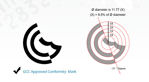
10- After the client finally approve and get the logo, the designer should deliver three electronic copies of the same logo, namely:
• A Photoshop raster copy -if available- to be used for the printed products in the form of CMYK.
• A copy for the electronic uses such as e-mails and websites. This copy is usually less in resolution to serve best in cases of sending and loading and it is usually in the RGB format.
• And the most important one of these copies, the one in Vector Logo format done by Adobe Illustrator or Corel Darrow programmers or Free Hand that can be printed in any size without significant impact on the quality of the logo.
————
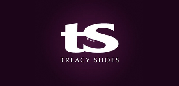
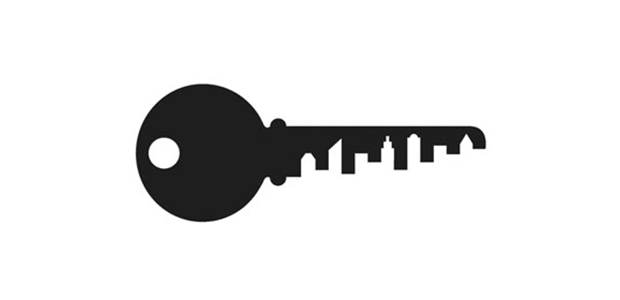
7- You can also use the Negative Space in the design of the logo. The negative space in the logo simply means the use of the background as a major or minor component in the design. One of the famous examples is the logo of FEDEX Company; there is an arrow connecting the letter “F” with the letter “X” which symbolizes the speed or the movement which are the main core of the activities of this international company.
The following samples represent the usage of the Negative space to create a drawing or form a main element in the logo.
———
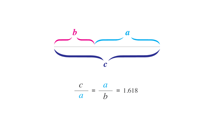
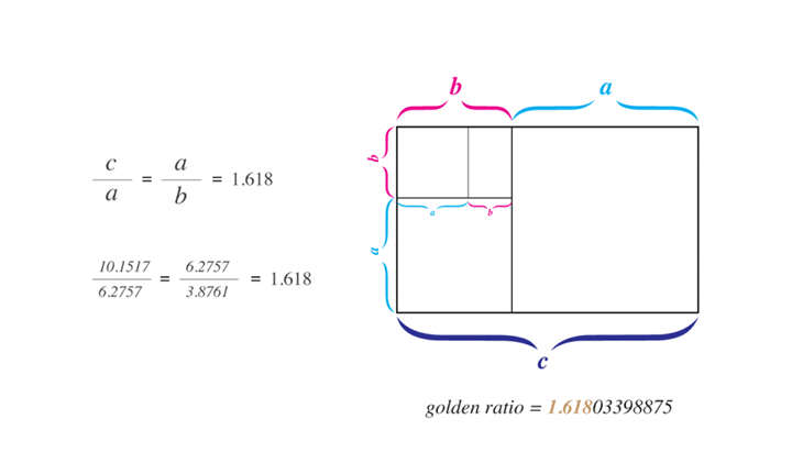
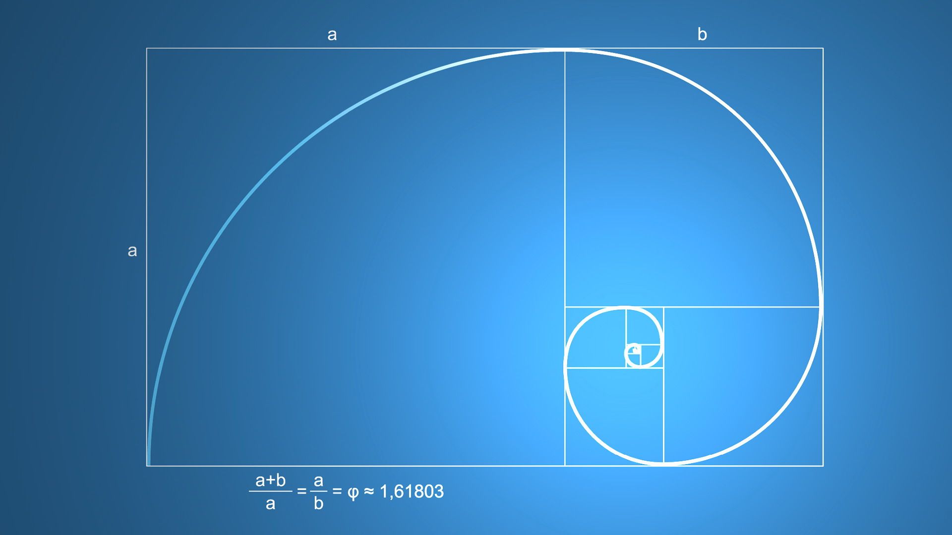
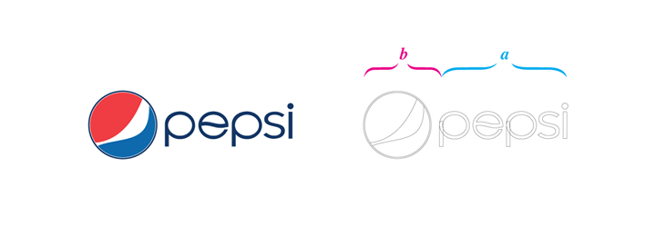
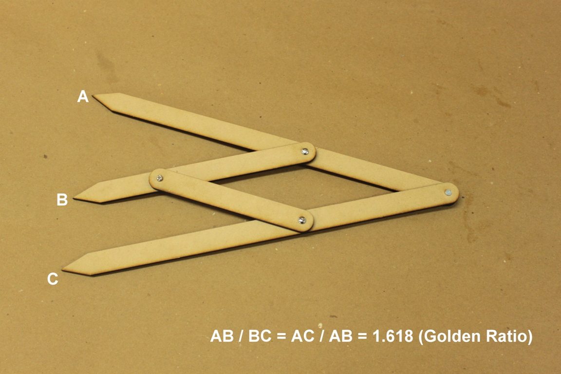
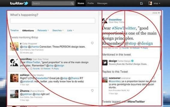
12- To conclude, i present an extended theory that i developed to help the designer and i call it the Golden Ratio Theory. This theory tackles the ratio in the design which is to be calculated by dividing two sides or elements in the design to equal 1.618.
It can be calculated as follows:
Dividing the total area by 1.618, will result in the length of the longest side.
When subtracting 1.618 from the total area, the result will be the length of the smallest side.
For example, if the total area is10 cm
The biggest side will be 6.18 cm
The smallest side will be 3.82 cm
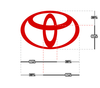
It can be approximated to the percentage to make the percentage ratio to the two sides 38/62%
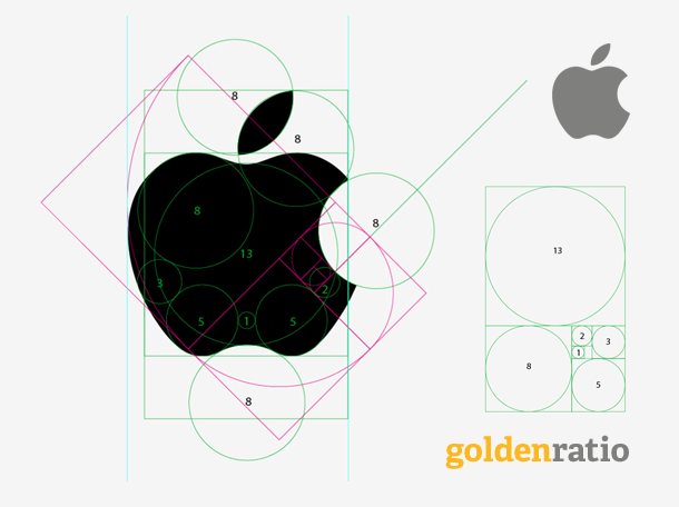
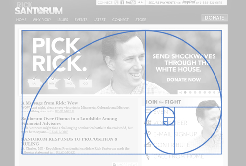
This percentage can be achieved through two sides as mentioned previously, or through the total percentage of the sides – thus called Fibonacci Spiral which is similar to the Golden Spiral.
Both the Golden spiral and the Golden Ratio can be used in design in general, whether architectural, casual, website or even in photography.
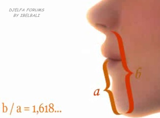
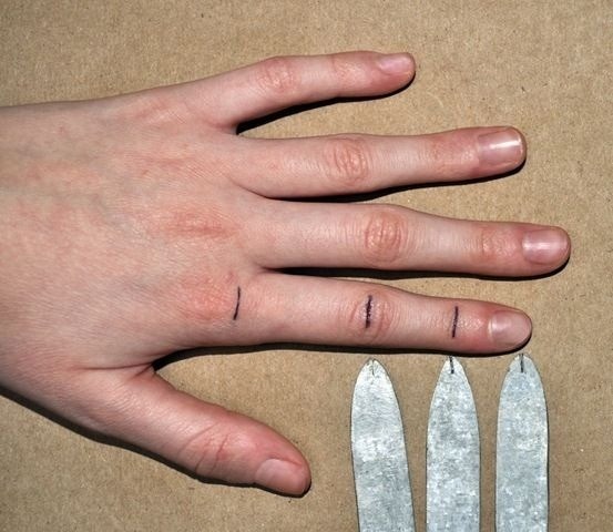
Many analysts confirm that Allah used the Golden Ratio Theory in the proportions of man’s creation, such as the ratio of the place of the belly button to the total height of the human being, the different proportions among the different thumps of the one finger or even the proportion of the nose to the whole face.
Others claimed that this theory was used in all the international famous designs and even in building Giza Pyramids.
The Golden Ratio Theory is a formula to determine beauty, however it is not the only criterion nor the only law of beauty and weight in artistic design. There are dozens of other laws and theories. Use this theory only when appropriate to make sure that it will not contradict with any other law or requirement that is more important than it, otherwise it will blow your efforts off. There are millions beautiful shapes in which the golden ratio never exist.
There is something else; the golden ratio is not calculated in mm nor Nano! The theoretical idea is that, the more the design is closer to the golden ratio, the more beautiful it will be. In other words, it is fine to achieve 40/60, or 35/65it is not an obligation to make it 38/62.Do not overload yourself nor blow your design in order to achieve exactly 38/62unless it is possible, of course.
Find attached many examples of achieving the golden ration in design, photography and proportions of human bones. The compass of the golden ration is also included.




————
The above mentioned elements are to be considered as guidance when designing a logo. Meaning that they are not rigid rules because it is known that creativity has no rules, or else it is not creation any more it will turn into a profession -way from excellence and impressiveness.
The designer has the upper hand; he should make his own choices concerning the previous elements. Only the creative professional designer knows how to formulate his ideas into innovation circulated and appreciated among everyone.
——–
NAB Advertising Agency has the honor to design logos and trademarks for many large, medium and small companies according to the international standards; such as:
Egypt Fund
Sinai University
Our sons Association in Makah
The conformity logo for GCC Standardization Corporate
Byotat Real Estate Company
Click here if you want to hire us to create your new impressive logo or for further inquiries.
From Egypt: 0112398692
Prepared and written by NAB Advertising Agency – Mohammed Berry
Main Arabic article : http://www.nabadv.com/index.php/ar/2014-01-29-01-25-13/223-logo-design-company
Keywords :
تصميم الشعار | تصميم شعارات | شركة تصميم شعار | شركة | العلامات التجارية | السعودية | قطر | الرياض | شركة تصميم لوجو | تصميم لوجو | شركة تصميم شعارات | لوقو | كيفية تصميم لوجو | logo design | logo maker logo design | logo design company | مخلخ | مخلخ يثسهلى ، مخلخ يثسهلى ؤخةحشىغ ، g,[, K ;dtdm jwldl auhv K av;m jwldl auhv K av;m jwldl g,[, K g,[, K jwldl auhv|شركة تصميم شعارات |شركة تصميم شعارات في مصر |شركة تصميم شعارات |شعارات مصر |شعارات

